
From Complexity to Clarity
Building Trust Through
User-Centered Report Design
About the Project
The project focused on redesigning technical property scrutiny and valuation reports used by banks and financial institutions during the loan approval process. The existing reports were information-dense, difficult to navigate, and visually intimidating, making it challenging for users to quickly locate critical insights and make informed decisions. The solution transforms the reports into a structured, user-friendly experience. By introducing clear information hierarchy, intuitive layouts, visual cues, and improved readability, the redesigned reports made complex data easier to understand, reduced cognitive load, and reinforced trust through clarity and consistency.
November 2025
2 weeks
Banking, Financial Services, and Insurance.
Redesigned Reports


The existing property due diligence reports were information-heavy, visually overwhelming, and difficult to scan. Users struggled to locate critical insights quickly, resulting in slower reviews and a less intuitive reading experience. The challenge was to redesign these reports to be more approachable, easier to navigate, and trustworthy while preserving the technical integrity of the information.
Clear Information Hierarchy
Well-defined sections for better flow and readability.
Introduced structured tables to present data in a clear and scannable format.
Added descriptive section headings to help users quickly locate key information.

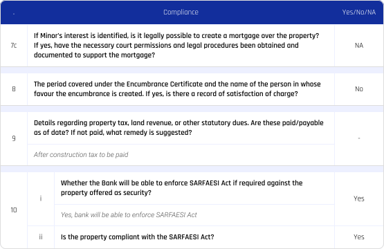
Intuitive Layouts
Reduced visual clutter by simplifying the presentation of complex legal and technical information.
Balanced text, tables, and white space to improve readability
Designed clean, uncluttered layouts that guided users through the report naturally.
Visual Cues
Introduced icons, color coding, and status indicators to highlight key findings and help users identify critical information at a glance.
This all helps guide attention and improve content scanning, and create a clear reading path.
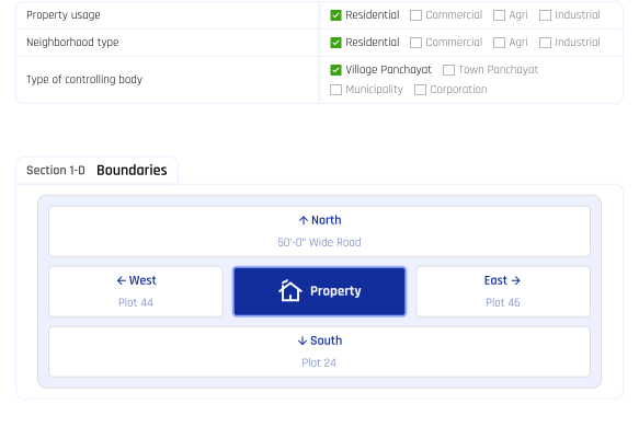
The redesigned reports made complex data easier to understand, reduced cognitive load, and reinforced trust through clarity and consistency.

Designed for real people.


Designed for


Thanks for stopping by!
Feel free to reach out for collaboration
purposes or just a friendly hello.
gshivangig@gmail.com

